Glenmark presented the world’s first symbol for hypertension awareness on 19th July 2020, which was endorsed by the Association of Physicians (India) and the Hypertension Society of India. But before we talk about it, we want you to take you through our thought process behind it, and why we thought the world needed it.
The Risks Of The Fast Life
 We are living our lives in the fast lane, on the go, non-stop! We want to make the most of the 24 hours we get every day, for 365 days a year. We want to grab every opportunity out there to move ahead. We want to walk, we want to run, but we don’t want to stop!
But, with our eyes fixated on the life we want to live, we are turning a blind eye to something really important. Something that is so vital, that without it, we wouldn’t be able to live the life we want: our body, and specifically, our heart!
While being constantly on the move, we need to pause for a moment and think about our heart. Why is it so important? Because amid all this hustle and bustle, you may be putting your heart at risk of attack from the silent killer: hypertension, also commonly known as high blood pressure!
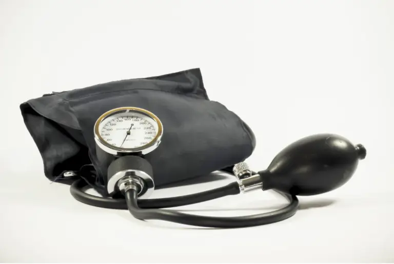
Hypertension: The Silent Killer
 Hypertension, or high blood pressure, is one of the fastest-growing health issues today. It accounts for around 9.4 million (94 Crore) deaths globally every year! In India, 1 out of every 3 people has it. And what is even more shocking than these numbers is that about 50% of the people with the disease are unaware about it! Most come to know about it when the disease metamorphosizes into life-threatening complications, like stroke, heart attack and kidney failure among others. This is where the infamous moniker ‘silent killer’ comes from. But, if it is such a critical disease, why isn’t it paid its due attention? The answer is simple: lack of awareness. It’s surprising as much as it is alarming when it comes to the prevalence of myths about hypertension.
- “It won’t happen to me”
- “It happens to old folks”
- “I’m still young to get affected”
There are so many of such misconceptions which can only be cleared through hypertension awareness.
Fighting Hypertension With Awareness
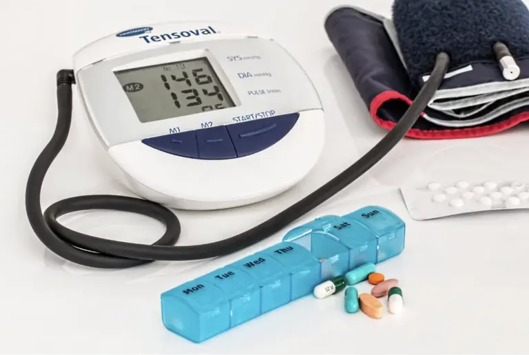
 As mentioned above, a person suffering from hypertension doesn’t know about it until they face critical complications. The main reason behind this is that hypertension does not have any specific symptoms of its own. Though frequent headaches, blurring of vision, dizziness and shortness of breath are some signs that have been associated with the disease, they are not a clear indication of it. In such a scenario, it is very important to convey the importance of heart health to people. So that they can not only take preventive measures, but also seek medical help in case of any issue.
The Need For A Symbol
 After the HIV outbreak in the USA in the 90s, the Red Ribbon symbol was introduced in 1991. The intention was to spread awareness about the disease and show solidarity with HIV-positive people. Since then, it has transcended boundaries and spread awareness across the globe. When it comes to high blood pressure, it has no global identity even though it is an equally critical disease. With low awareness, it gets to maintain its reputation as a silent killer. It is a need of the time to bring the disease and its risks to light, and a high BP symbol is the best vehicle for the purpose.
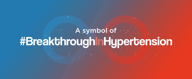
Presenting The World’s First High Blood Pressure Symbol
 Glenmark has been a leader in the hypertension medicines for a significant period of time. While we were helping people fight hypertension through our medicines, we believed we needed to go the extra mile if we have to win the battle against this disease. So, on 19th July2020, we gave the disease its very own identity!
We ensured this identity wasn’t just some symbol developed overnight. A lot of expert thought and consideration went in developing this identity.
- The identity was worked upon for more than a year
- The designs were sent to 50,000 doctors across India and their opinions were recorded
- After much scrutiny and thought, the final identity was arrived at
- The result was in the form of a first-of-its-kind Hypertension symbol
- This was approved by 50,000 doctors
- What makes it even more noteworthy is that it has been endorsed by the Hypertension Society of India (HSI) and the Association of Physicians, India (API)
Symbolism Behind The Logo
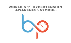
![]() The high blood pressure symbol is designed by Madhukar Raju, one of the best designers in the world. Every element of the logo represents an important aspect related to hypertension and its awareness.
The high blood pressure symbol is designed by Madhukar Raju, one of the best designers in the world. Every element of the logo represents an important aspect related to hypertension and its awareness.
- The infinity shape stands for the limitless benefits of controlling blood pressure
- The same shape has been so designed so perpetually represent the letters ‘b’ and ‘p’ – the abbreviation for Blood Pressure
- Red and blue colours stand for the balance between oxygenated and deoxygenated blood, which is essential for BP maintenance
- Lastly, the tagline conveys the simple-to-understand message we want to send out
The symbol thus represents all the effort and support that will be needed to raise awareness about hypertension at a global level.
It was a proud moment for Glenmark to present the high BP symbol to the world. With this symbol, we aim to commonise the various aspects of the condition as much as possible and help people fight it. We hope that it will achieve what it has been made for.
It has just been a few days since we unveiled the new identity, and it has been chosen by 50,000 doctors across India! Going further, we hope that this symbol will inspire people to take care of their heart, blood pressure, and life!
Answer a few questions and get a free diet consultation from our Nutritionist.
Get your free Diet Consultation
Disclaimer
The information contained in this article is to educate, spread awareness in relation to hypertension and other diseases to the public at large. The contents of this article are created and developed by BPinControl.in through its authors, which has necessary, authorisations, license, approvals, permits etc to allow usage of this articles on The Website. The views and opinions expressed in this article are views, opinions of the respective authors and are independently endorsed by doctors. Although great care has been taken in compiling and checking the information in this article, The Website shall not be responsible, or in any way liable for any errors, omissions or inaccuracies in this article whether arising from negligence or otherwise, or for any consequences arising therefrom. The content of this article is not a substitute for any medical advice. The Website shall not be held responsible or liable for any consequence arising out of reliance on the information provided in the article.